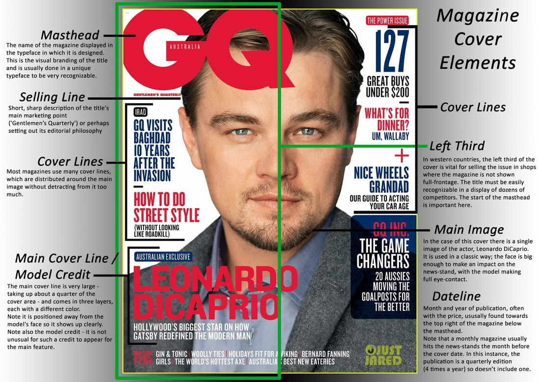
Magazine Cover
Part 1: Complete the handout in Google Classroom using the images above.
Part 2: Complete 2 Magazine Covers
| magazine_template.psd | |
| File Size: | 139 kb |
| File Type: | psd |
Your assignment is to create two magazine covers that include you as the star.
You must have:
_____Unity can be achieved by carrying out a common theme in the type styles, photos, story titles and descriptions. Do all the parts work together?
_____Think about readability, can you read the type against the background? Is the type style readable? Are the sentences too long? Are the titles descriptive enough to make you know what the article is about? Does the type size signify the importance?
_____Does the photo or photos support the theme? Does the photo catch your eye? Is it too busy or too simple?
_____How is your effort and craftsmanship? You will need to be selecting, cutting, pasting and cropping. Does your cover look professionally neat?
_____Layout, how did you arrange all the elements? Is the type all lined up flush left, right, centered? Is the type over the picture or a background? Did you add a banner with the issue date, web site, and cost? Does the layout make it easy to read or confusing?
A good cover needs to accomplish four things:
1. Identify the personality of the magazine.
2. Attract the target audience
3. Lure the reader into the magazine
4. Establish a visual identity (consistent use of format)
- Copycat Real Magazine - One should be modeled after a real magazine - Photo of you should be still shot
- Your Magazine - One should be a made up magazine, your own title and design - Photo of you should be doing something (you can include friends)
You must have:
- A Masthead
- Selling Line
- Cover Lines
- Main Cover Line/Model Credit
- Main image (you)
- Issue date
- Issue price
- Maximum of 2 fonts in three different colors
- Title can be a third different font - Something fancy for Your Magazine or the actual font of the Real Magazine
_____Unity can be achieved by carrying out a common theme in the type styles, photos, story titles and descriptions. Do all the parts work together?
_____Think about readability, can you read the type against the background? Is the type style readable? Are the sentences too long? Are the titles descriptive enough to make you know what the article is about? Does the type size signify the importance?
_____Does the photo or photos support the theme? Does the photo catch your eye? Is it too busy or too simple?
_____How is your effort and craftsmanship? You will need to be selecting, cutting, pasting and cropping. Does your cover look professionally neat?
_____Layout, how did you arrange all the elements? Is the type all lined up flush left, right, centered? Is the type over the picture or a background? Did you add a banner with the issue date, web site, and cost? Does the layout make it easy to read or confusing?
A good cover needs to accomplish four things:
1. Identify the personality of the magazine.
2. Attract the target audience
3. Lure the reader into the magazine
4. Establish a visual identity (consistent use of format)


